What did you do this Semester?
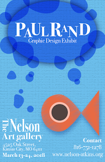
Paul Rand Project
 The project was to research a graphic designer randomly selected for you and make a presentation about them and also make a poster advertising their works in a museum. The project took 3(?) weeks to complete. One (1) week spent on researching and writing up a essay, another week spent on creating a powerpoint, and the last week working on the poster. The hardest challenge I faced was pin pointing my graphic designer. He had an easy style to replicate but I couldn't quite pinpoint what it was that made his designs so neat. Some feedback I was given was to focus more on his way of drawing shapes where they aren't perfect. In the poster I added some bubbles that were not perfect circles. My overall opinion is that I loved this project, I only wish that we had one more piece to do with it because I feel I finally pin pointed his design on the poster section.
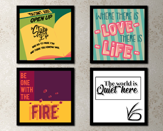
Typography Quote project
 This was one of my. favorites because it allowed me to have complete freedom. The project was to Pick 4 quotes and then make an illustration going along with them. I choose quotes I had a connection with. The quotes I choose were "You can't just open up the story of my life and go to page 738 and think you know me" -Arin Hanson liked this quote because not only was it said by someone who gives me a lot of inspiration but because I like the message behind it. "Where there is love there is life" -Ghandi "Be one with the fire" -Unknown "The world is quiet here" -Lemony Snickett
I think mine took 1.5 weeks because I remember getting done early. I learned about color schemes a lot more in depth in this project. Some feedback I was given was for the 'Be one with the fire' illustration. The original design had way too much empty space so to solve that I changed the font for 'Fire', added some flame sparks, and boxed It off with darker colors. I loved this project, my only regret was not finding out about the free Webster brushes that Adobe had for download. If I downloaded them at the time of this project I can guarantee it would look 1,000 times better.
Rebranding Project
The goal of this project was to take an already existing brand and give it a makeover. My mother gave me a bunch of recommendations of things who were seriously lacking in the graphic design department but I wanted to try my hand at a more rustic logo so I went with Shatto milk. I believe we had 3 weeks to finish this project. My biggest challenge was coming up with a logo and deciding colors. I learned a lot more on how to actually use illustrator more effectivly in this project.
Misc Projects
When I was done with an assigned project, I worked on something small so I could learn to use the program better. These are some pictures of my personal works:
This was my first personal project and I learned a lot since first starting this in quarter one. I might remake/ finish it Once I get back from break.
This Project was a test with minimalism by using animal crossing characters
As a first step of one of my bigger personal projects, I made a vector of my art
My homemade Birthday Invitations! The Hierarchy is a little messed up in the "Happy Birthday to Raina" but I'm really proud of this
Time in class
I used my time in class pretty well. When I was finished with a project early, I usually went into photoshop or Illustrator and tested out things. I recently downloaded the Free Webster brushes so for the last few days I worked on getting to know those and seeing what I could do with them. Outside of class I like to look at logos and learn about them. Did you know that the new Google logo's G does not have perfect lines that go through? Well that design was purposeful!Strengths and Weakness
I think my biggest strength is my passion and the fact that I already have a background in art classes and creativity. I think in the future I might be doing illustrations for children's books. I also have a huge love for Typography. My biggest weakness would probably be layout, Hierarchy, and the fact that even though I love typography with my whole heart, I suck at it a lot.
Summary
I loved slowly learning more about the program and developing a better sense of awareness in my works. I think I would probably change and redo most of my projects because with my new knowledge I know I can do better. Next year, I hope to study more about typography so I can confidently say "I'm okay at typography." A big goal maybe but I love type and illustrations and I also hope next year I can come up with a better Behance layout.


